
Google's Gmail Redesign Is a Signal About Its AI Strategy

Google just made its AI strategy visible in the most literal way possible — by redesigning the icons you see every day.
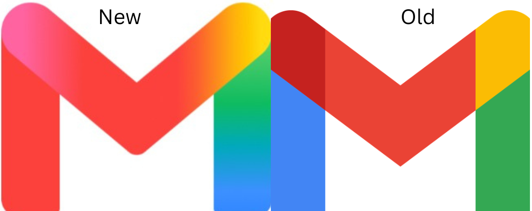
Starting May 18, 2026, Gmail, Google Drive, Docs, Sheets, Slides, Calendar, Meet, Chat, Keep, Forms, and Tasks all received new icons replacing the flat, primary-color design that had been in place for nearly six years. The new look features soft gradients and a design language Google explicitly describes as an "AI aesthetic."
This isn't just a cosmetic refresh. According to reporting by 9to5Google and Droid-Life, Google introduced this gradient design language for its core "G" logo about a year ago, explicitly linking it to AI integration. That visual identity has now extended to the entire productivity suite — a deliberate signal about where the company is heading.
Key Takeaways
- The redesign covers 11 core Workspace apps and rolled out days before Google I/O 2026, where Gemini AI featured prominently
- The new icon set addresses a long-standing criticism: the old apps were too visually similar. The new designs make each app more distinct through shape and color differentiation
- Google has applied this gradient language progressively — first to Google Home, Photos, Maps, and Gemini — and is now unifying its entire ecosystem under one AI-forward visual identity
Several questions remain unanswered: whether the redesign extends to favicons, how gradients will render in dark mode, and whether users can revert to the old icons.
For brand and marketing leaders, this is a case study in using visual identity to communicate strategic direction. Google isn't just building AI products — it's making AI visible in every interaction.
🔗 Read the full article on Brand Communicator
Stay in Rhythm
Subscribe for insights that resonate • from strategic leadership to AI-fueled growth. The kind of content that makes your work thrum.
More from Thrum
Additional pieces exploring adjacent ideas